
Banking Dashboard | Nezz
Two Products needed to feel like one
A banking dashboard that brings balances, transactions cards, transfers, and financial activity into the marketplace without making the two experiences feel disconnected.
Role
Lead UX/UI Designer
Platform
Responsive Web
Timeline
2-3 Months
Collaborators
Founders, Engineers
The Challenge
A product within a product …
Banking introduced an entirely different type of experience into the Nezz marketplace. Users needed to move from browsing and purchasing high-value items to managing financial information and completing banking tasks without becoming confused about where they were within the platform. The challenge wasn't simply designing a banking dashboard. It was figuring out how banking should exist within Nezz.
Information Architecture
Creating a clear structure for banking
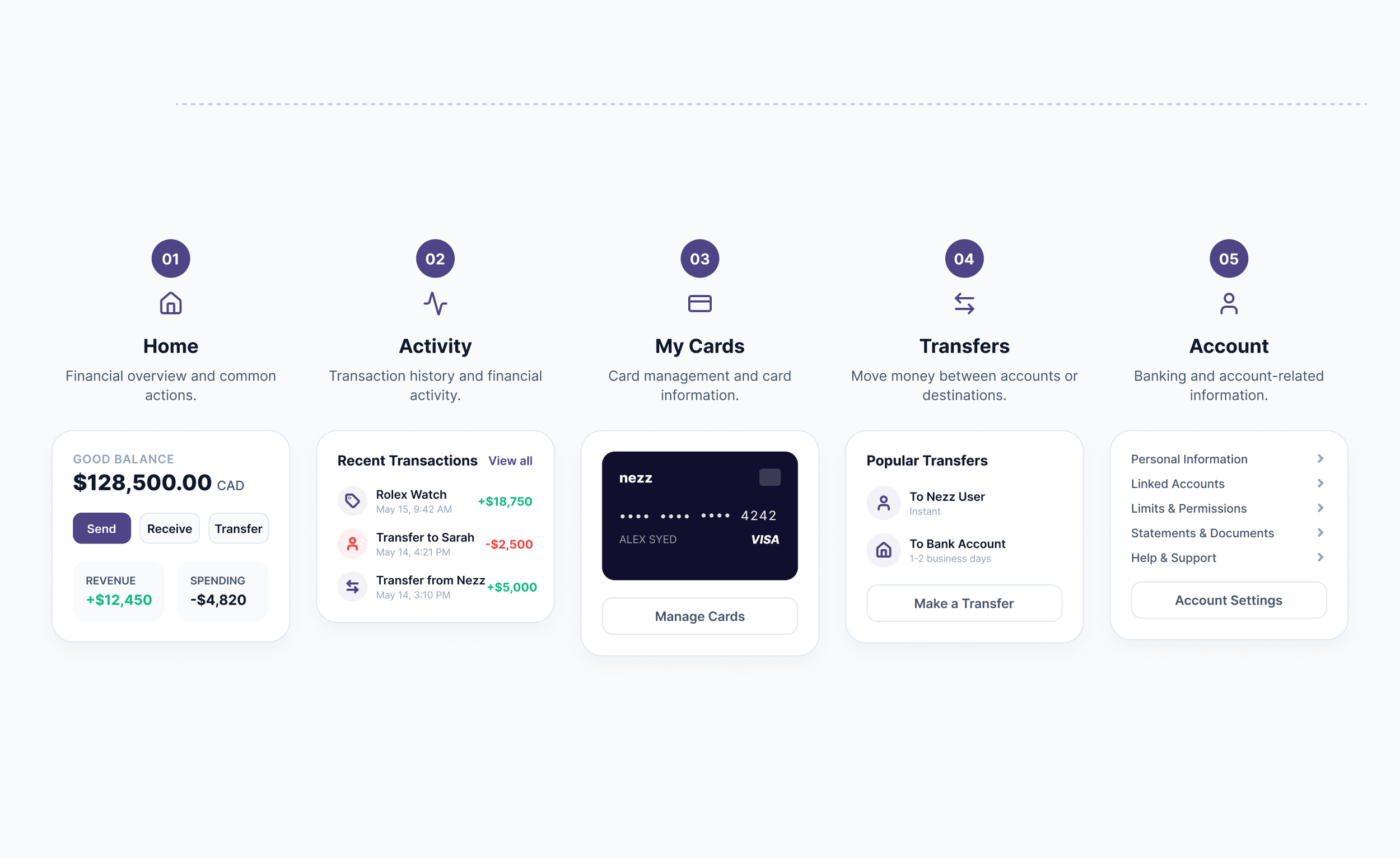
Once the navigation direction was established, I organized the banking experience around five primary areas.
This structure allows the dashboard to act as an overview while giving more complex tasks dedicated spaces.
01
The Command Center
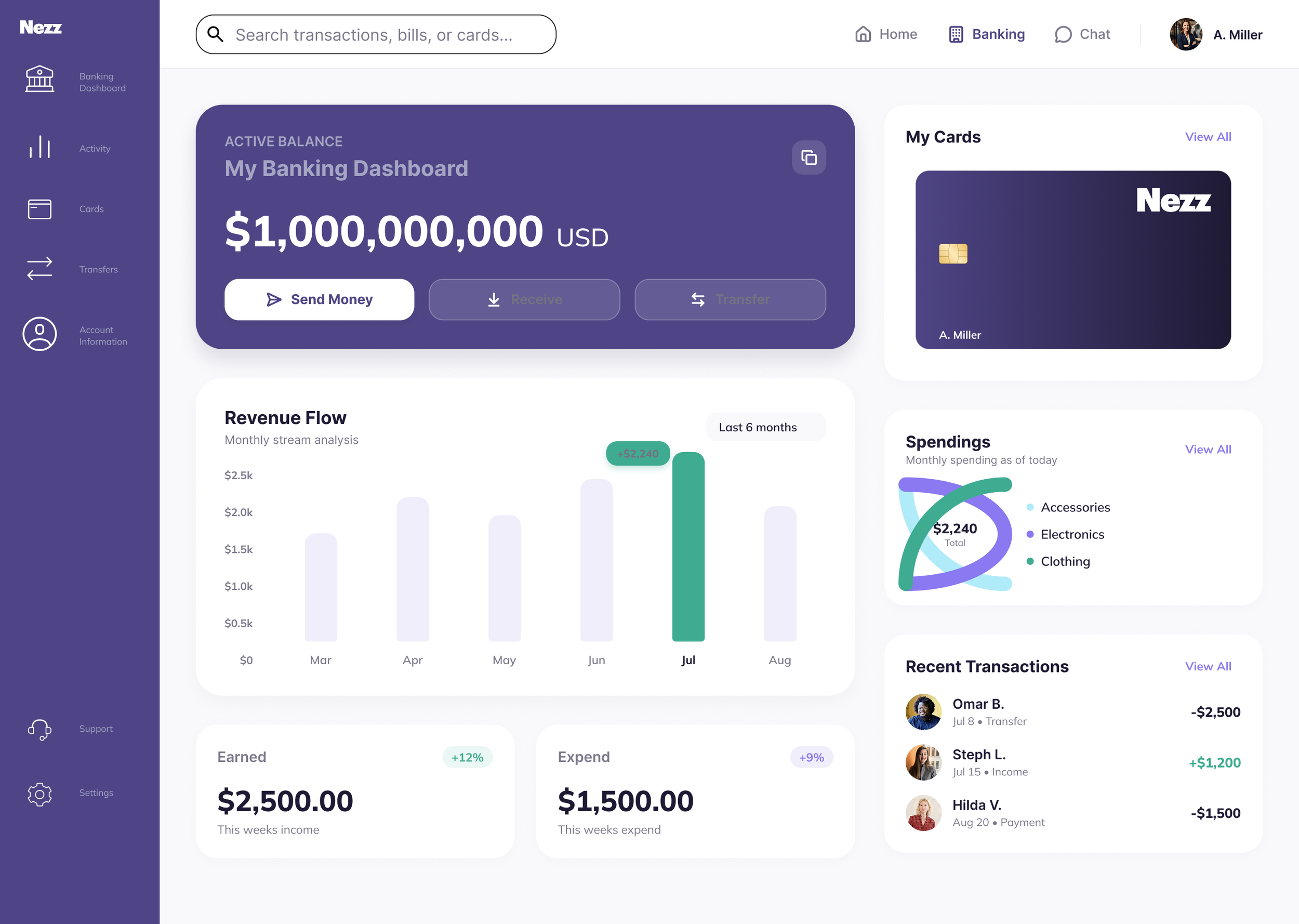
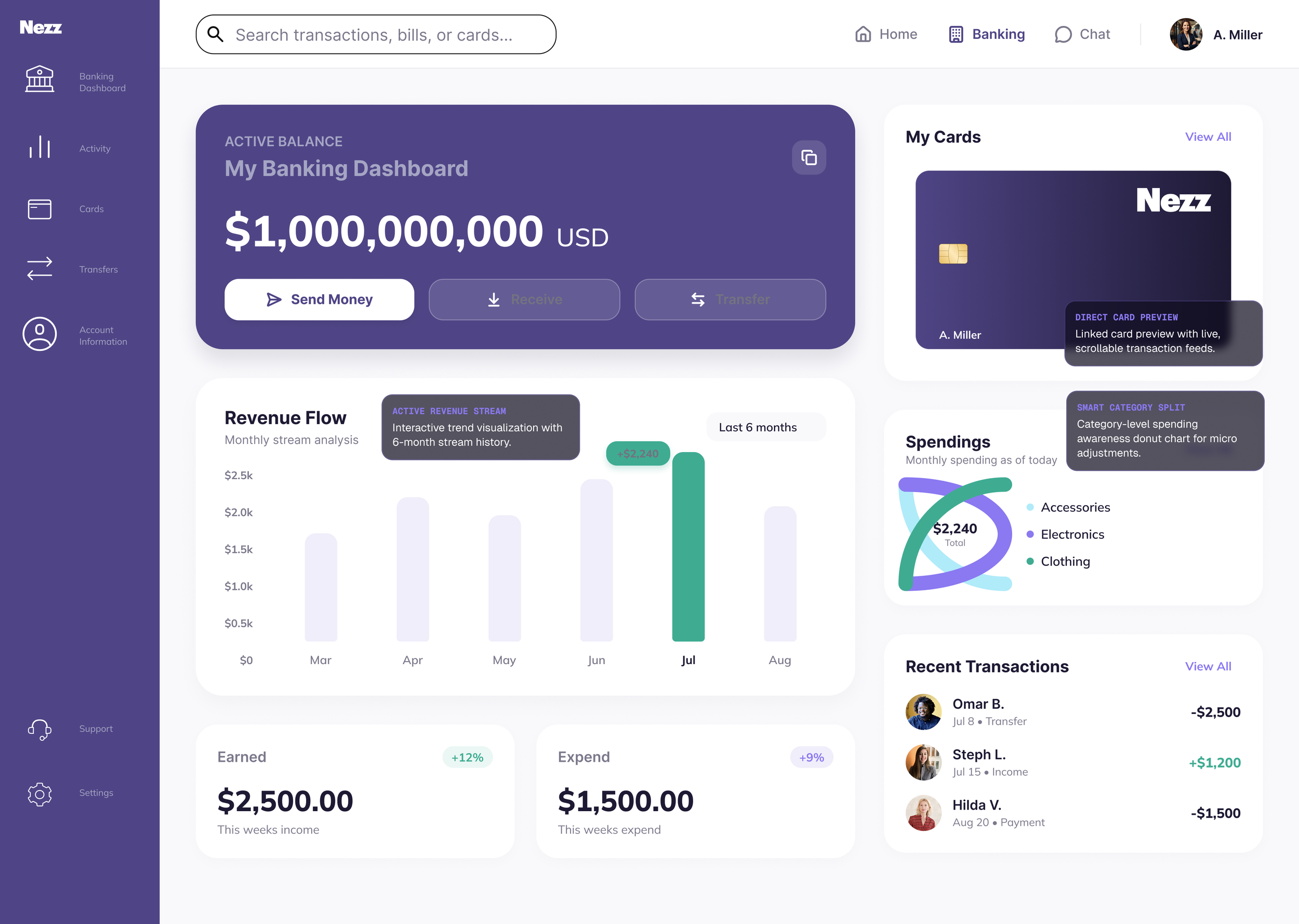
The primary goal of the Nezz Dashboard was to reduce cognitive load while managing extremely high balances. We integrated an instant-action financial hub with physical & virtual card management on a single workspace plane. By structuring key insights on the left and secondary spending analytics on the right, users gain complete situational awareness in under three seconds.
02
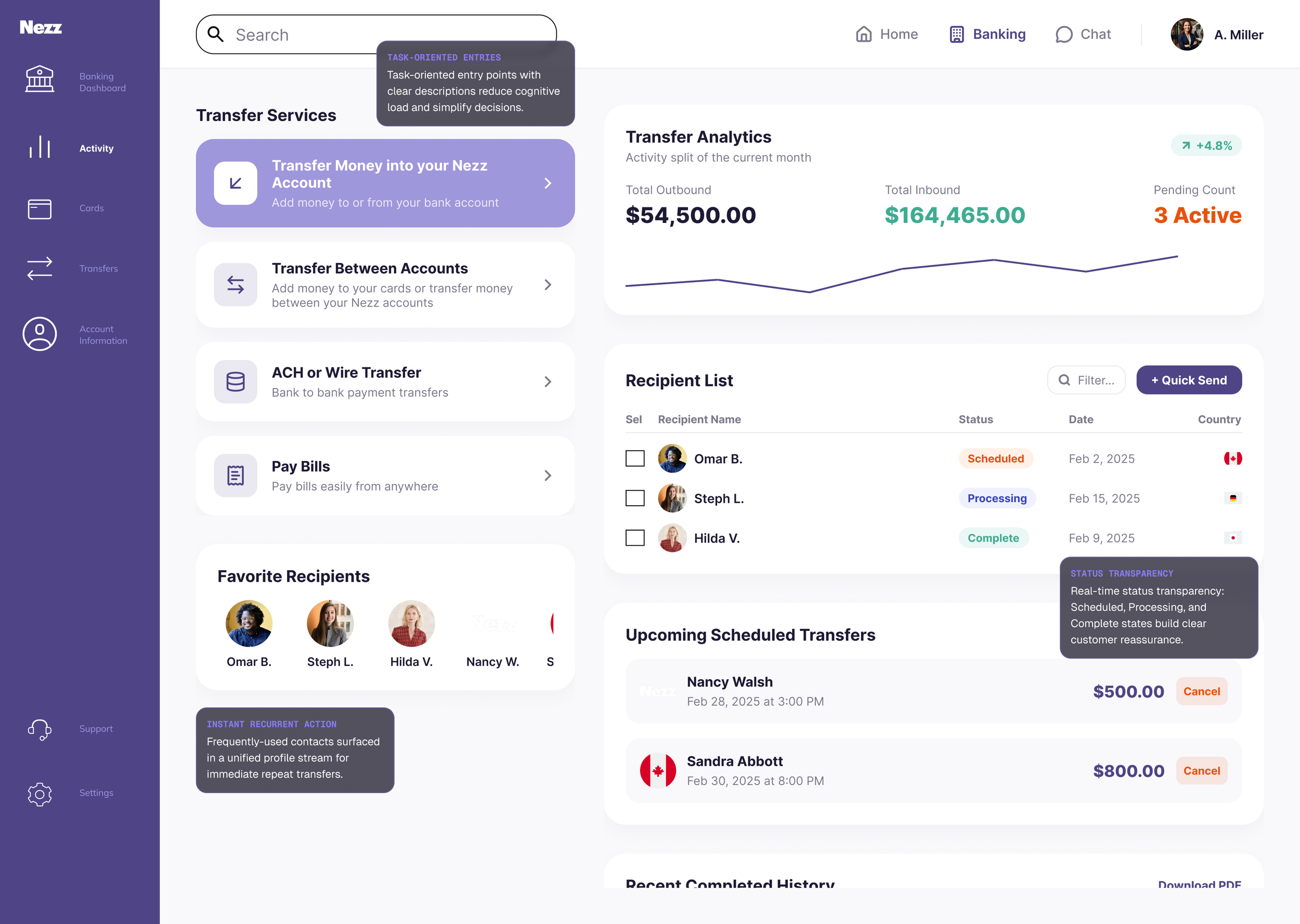
Frictionless Money Movement
04
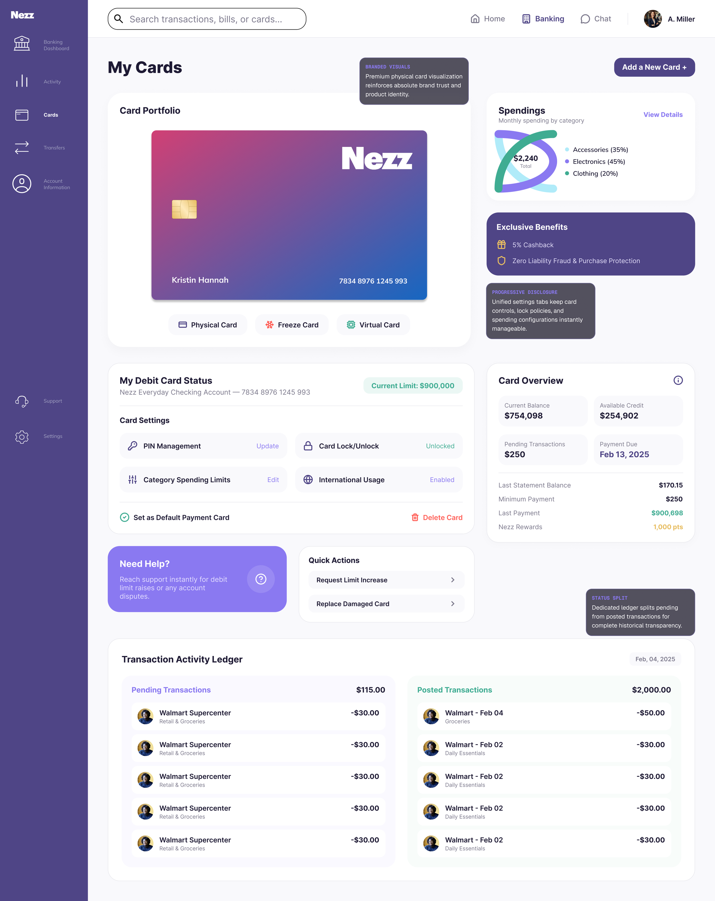
We consolidated complex card management from dynamic security freeze parameters to physical versus virtual configuration models into a single, contextual interface view. This eliminates the deep-menu hunting typical of traditional platforms.
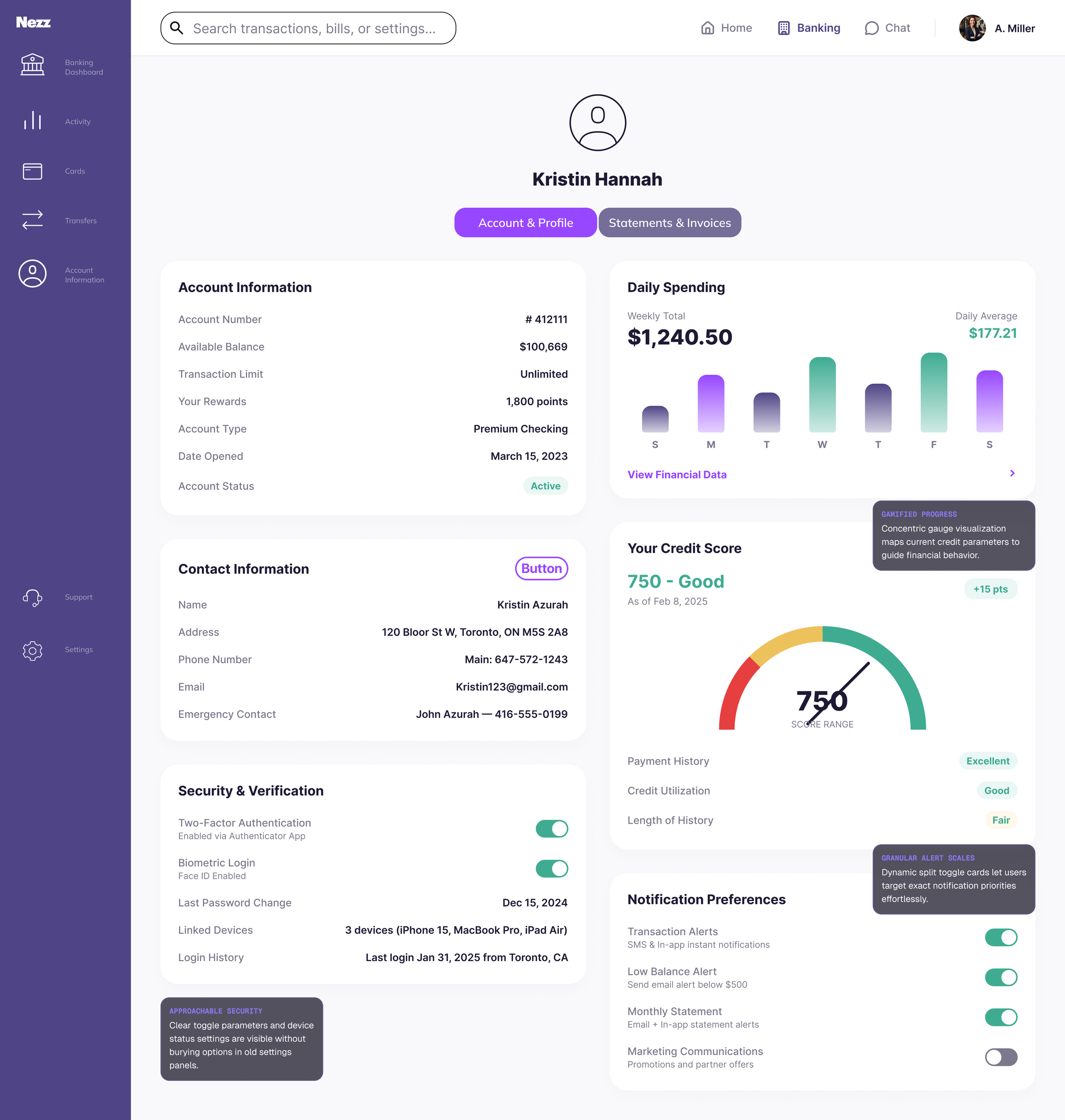
Security Meets Simplicity
The Banking Experience
Real-Time Pulse
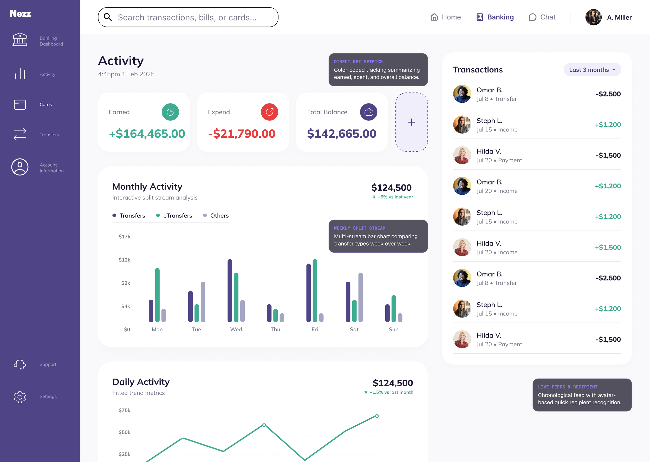
Transforming raw, complex transaction metrics into simple, visual stories. The Activity stream translates daily micro-transactions into instant visual trends that shape long-term financial health.
03
We structured the transfer experience into logical, task-oriented pathways designed to reduce the friction and cognitive load of money movement. Standardizing core channels means each type has a clear, understandable entry point while favourites surface for quick actions.
Complete Card Ecosystem
05
High-assurance account security tailored for high-net-worth customers. By structuring complex two-factor authentication, biometric logins, and credit score gauge visualization into clear multi column layouts, we make system state immediately obvious. Security ceases to be a list of configuration menus and becomes an interactive, visible shield.
Making Common Tasks Immediately Accessible

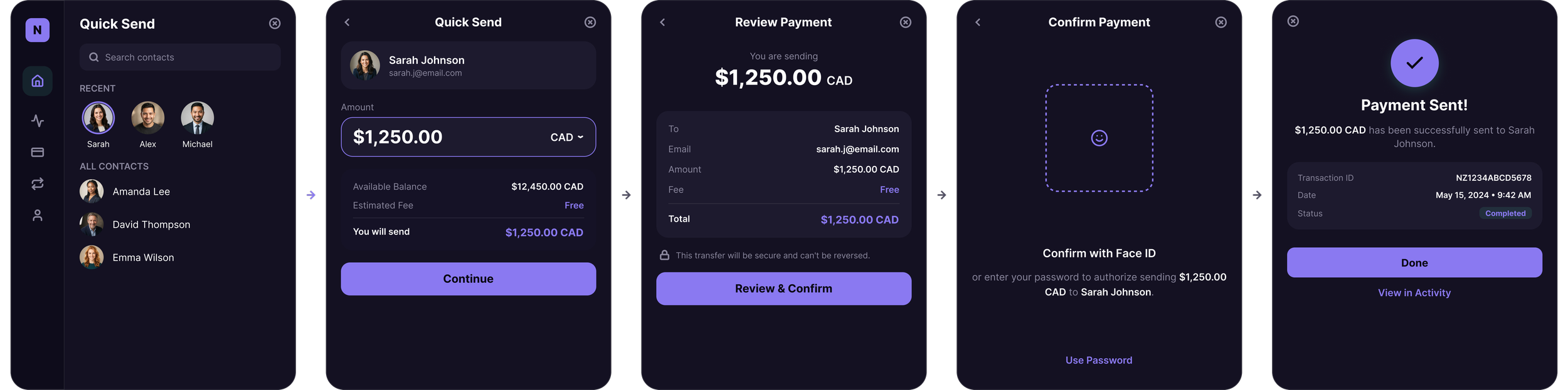
Send, Receive, and Transfer are the most frequent financial actions. I designed a Quick Send as a short focused flow that keeps users in context.
Outcome
I designed approximately 12 core Banking Dashboard screens, along with supporting states, light and dark mode, and interactions across the banking experience.
My work established the navigation model, information architecture, dashboard hierarchy, quick financial actions, and supporting banking flows that could be reviewed with the founders and handed off to engineering. Because Nezz was an early-stage startup, customer adoption and product-performance metrics were not yet available for this version of the experience.
The outcome of my work was the creation of a structured, implementation ready Banking experience that translated the founders' vision into a product direction the team could build from.
Reflection
The Banking Dashboard changed how I think about visual hierarchy. When I began the project, much of my attention was focused on determining what information needed to appear on each screen. As the dashboard evolved, I realized that deciding what users should notice first was just as important as deciding what information should exist. Complexity isn't always solved by removing information, sometimes the solution is creating stronger relationships between information so users can understand what matters now and what can wait.
If I revisited the experience today, I would continue testing the navigation as the product expanded and conduct additional usability testing around the dashboard's financial information to understand which insights users find most valuable. Designing the banking dashboard taught me that a good hierarchy doesn't just organize an interface, It helps users understand it!
Designing onboarding that teaches before it asks.
NEXT CASE STUDY
How I approached onboarding for a platform combining marketplace and financial experiences.