Nezz | A marketplace
for luxury items
INTRODUCTION:
Ooreva sought out to enhance their mobile platforms user experience, a fintech enabled marketplace with AI and peer to peer payment for high value items. The Nezz app is a seamless peer to peer marketplace which allows for the best user experience whether you are a buyer or seller by avoiding scams and extensive negotiations.
KICKOFF:
I was introduced to the team and familiarized with work that was previously done on the app. The project’s scope, goals, and prior research were discussed and tasks were assigned amongst the designers. After establishing effective communication channels, we familiarize ourselves with project milestones, important deadlines, and how to keep up communication through slack and decided on meeting twice a week.
TEAM:
Stakeholder: Lopsii Olagoke, Project Manager: Hiba Altaf, UX/UI Designer: Juhee Kumari, UX/UI Designer: Naima Syed, UX/UI Designer: Tasmin Rahman
-
My Role
UX/UI Designer: Ideate, Design, Prototype, & Test
-
Tools
Figma, Slack & Microsoft Teams
-
Timeline
One month
Problem
How Might We develop a marketplace platform that focuses on transactions, generative AI, and mitigate scams in peer-to-peer markets?
Deliverables
Ideate, Design, Prototype, & Test
Research
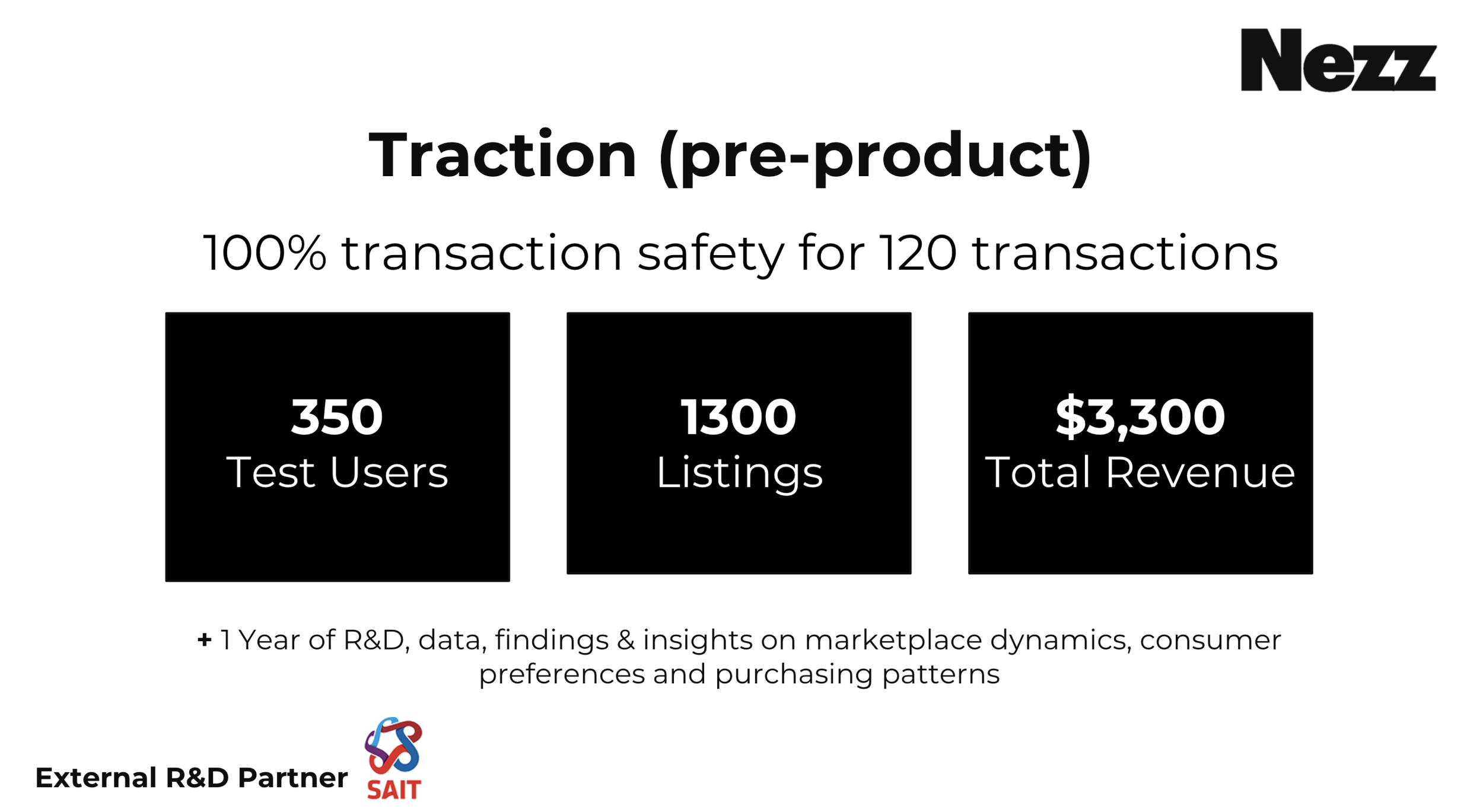
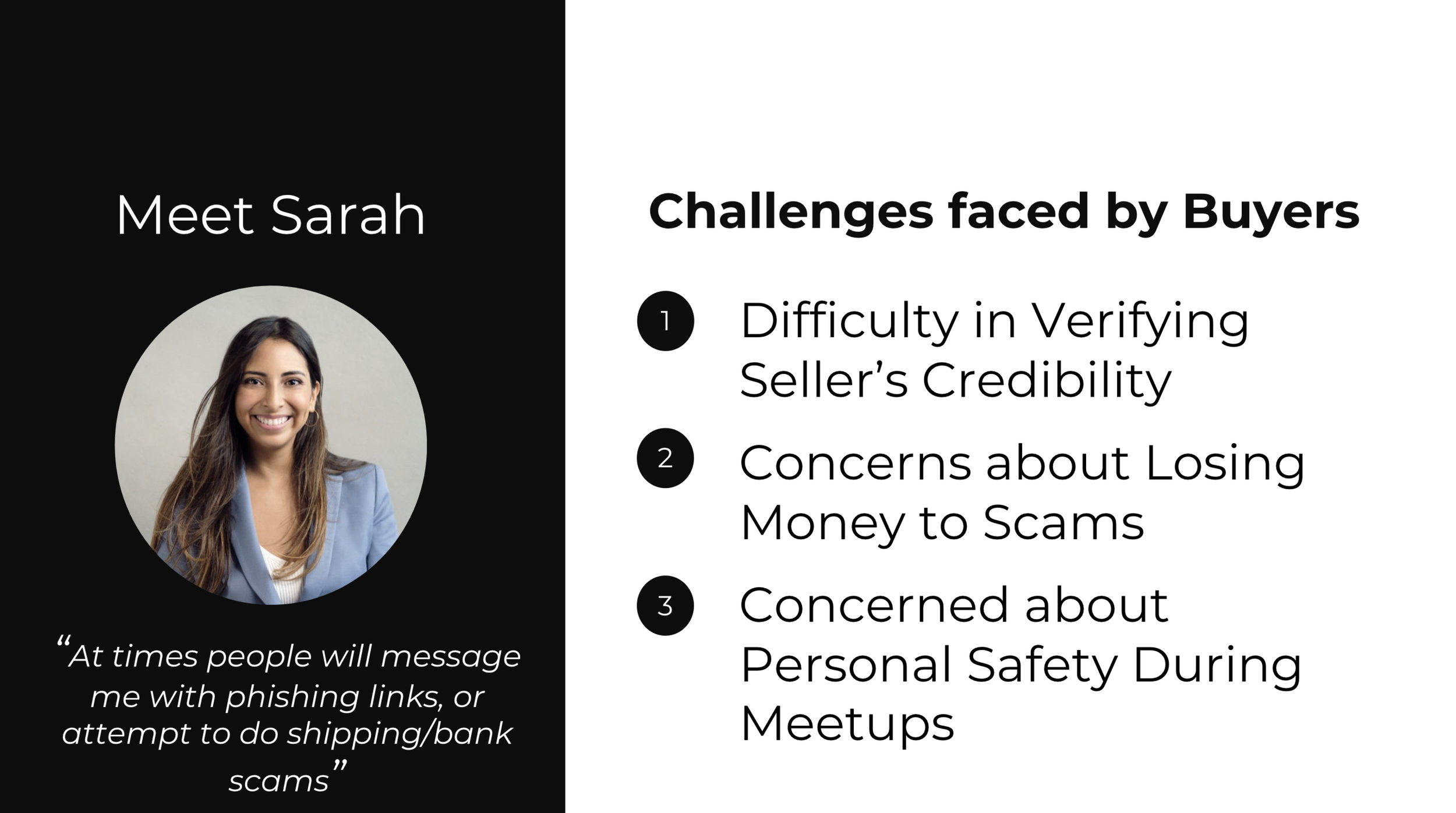
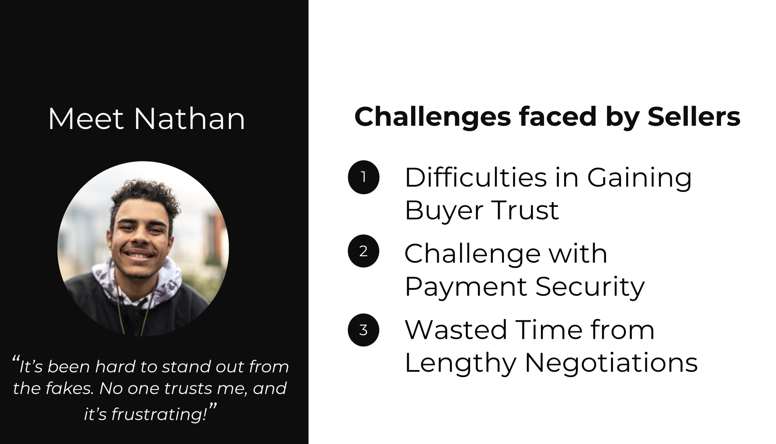
Every year people lose about $3.3 billion using peer to peer marketplace platforms (2020). By 2025 that amount will rise by 11x to $33 billion.
Secondary Research
Persona
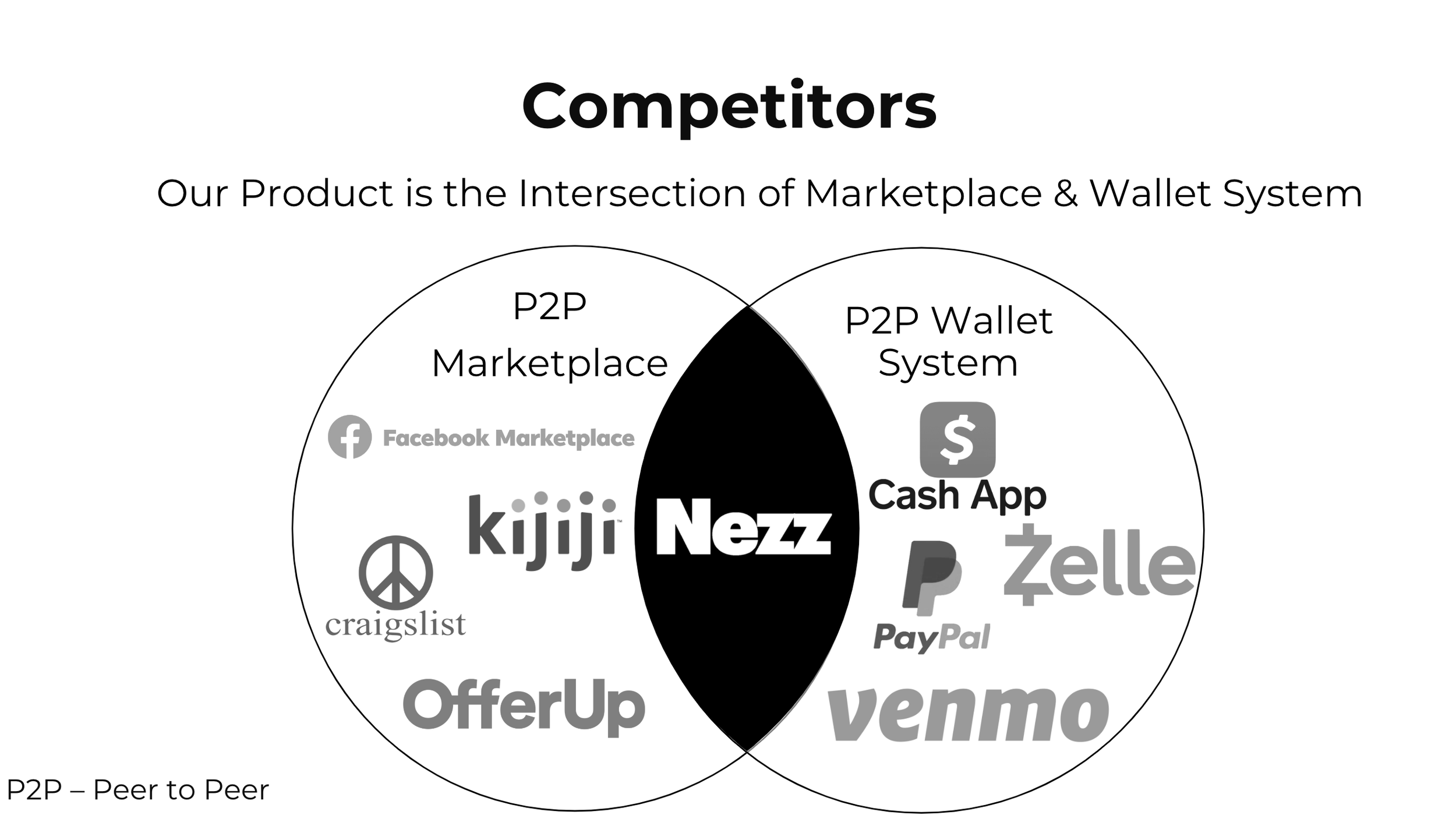
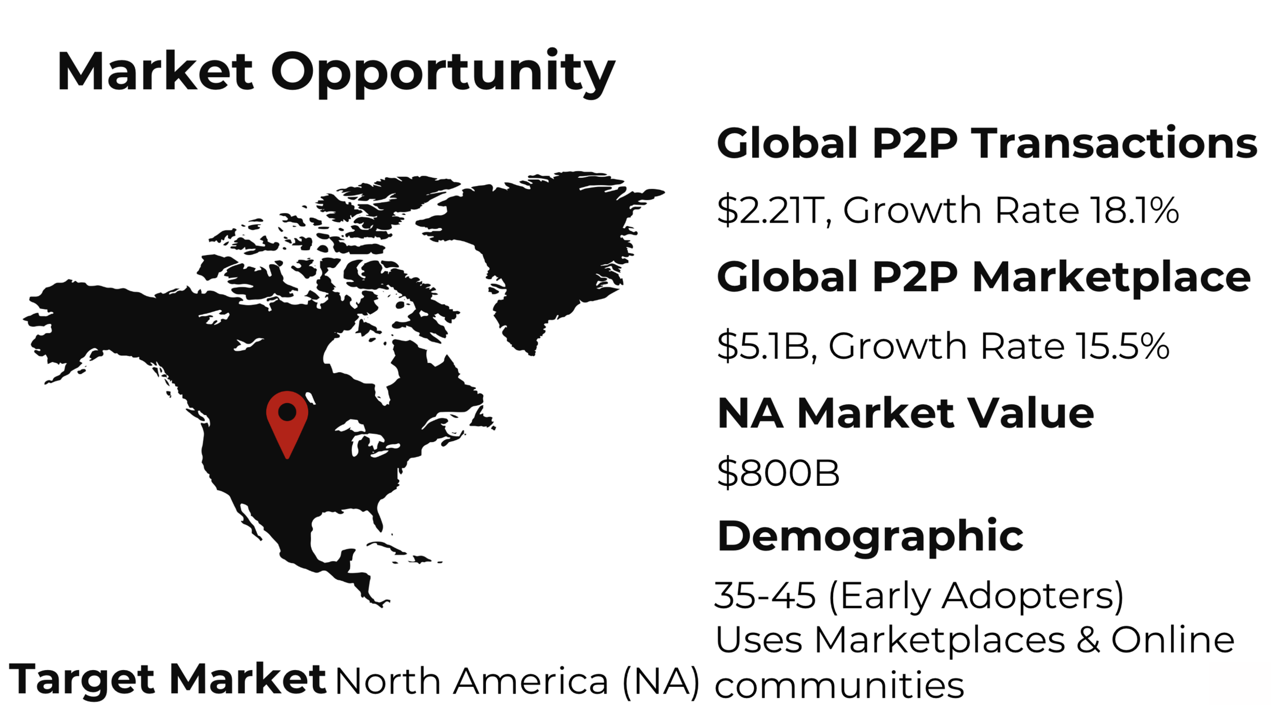
The top most used P2P marketplace apps commonly used today (depending on niche) are Ebay, Esty, FB marketplace and Amazon. Almost all of them use 3rd party payment transactions and have not yet adopted AI into their designs.
Wallet |
Step 1
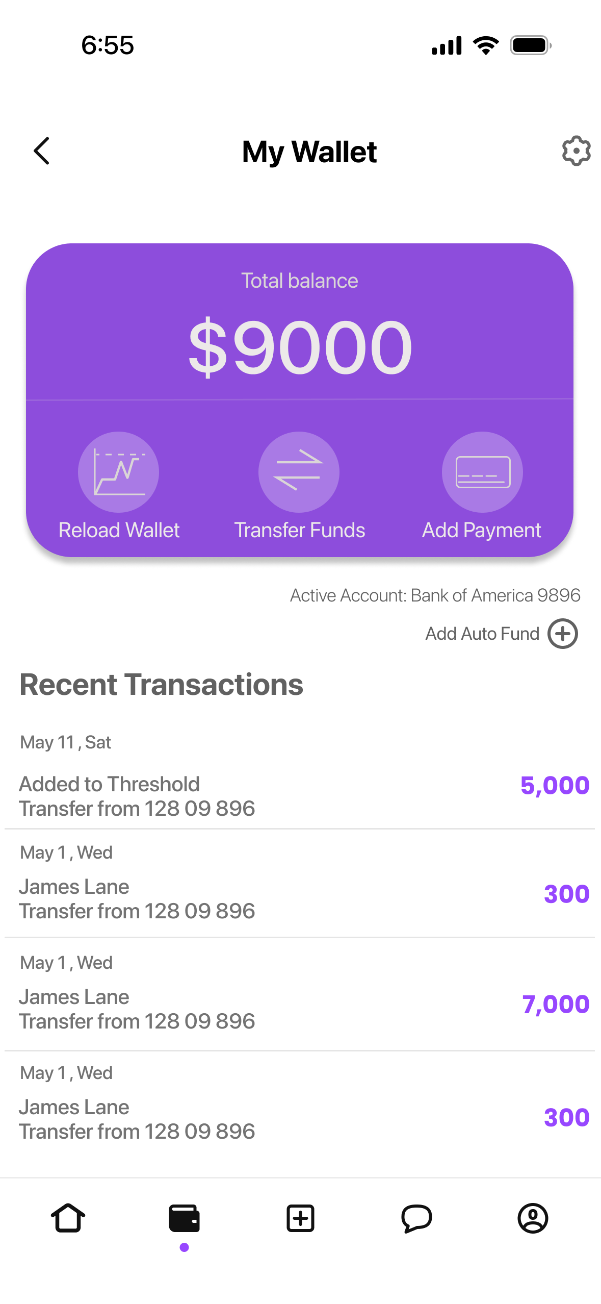
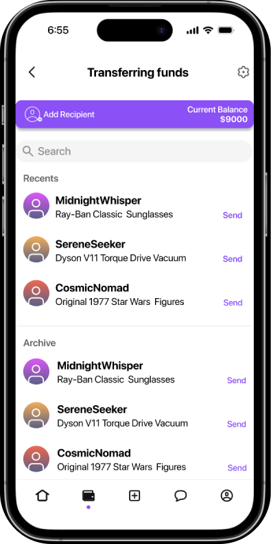
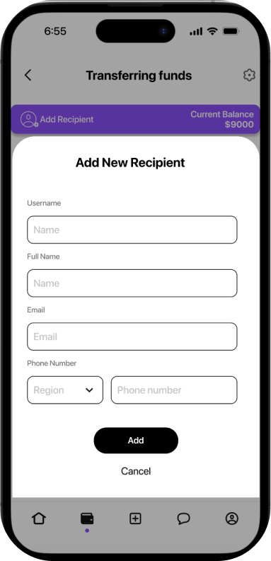
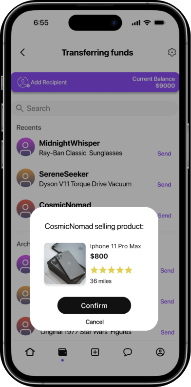
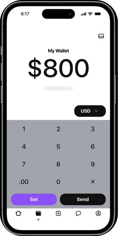
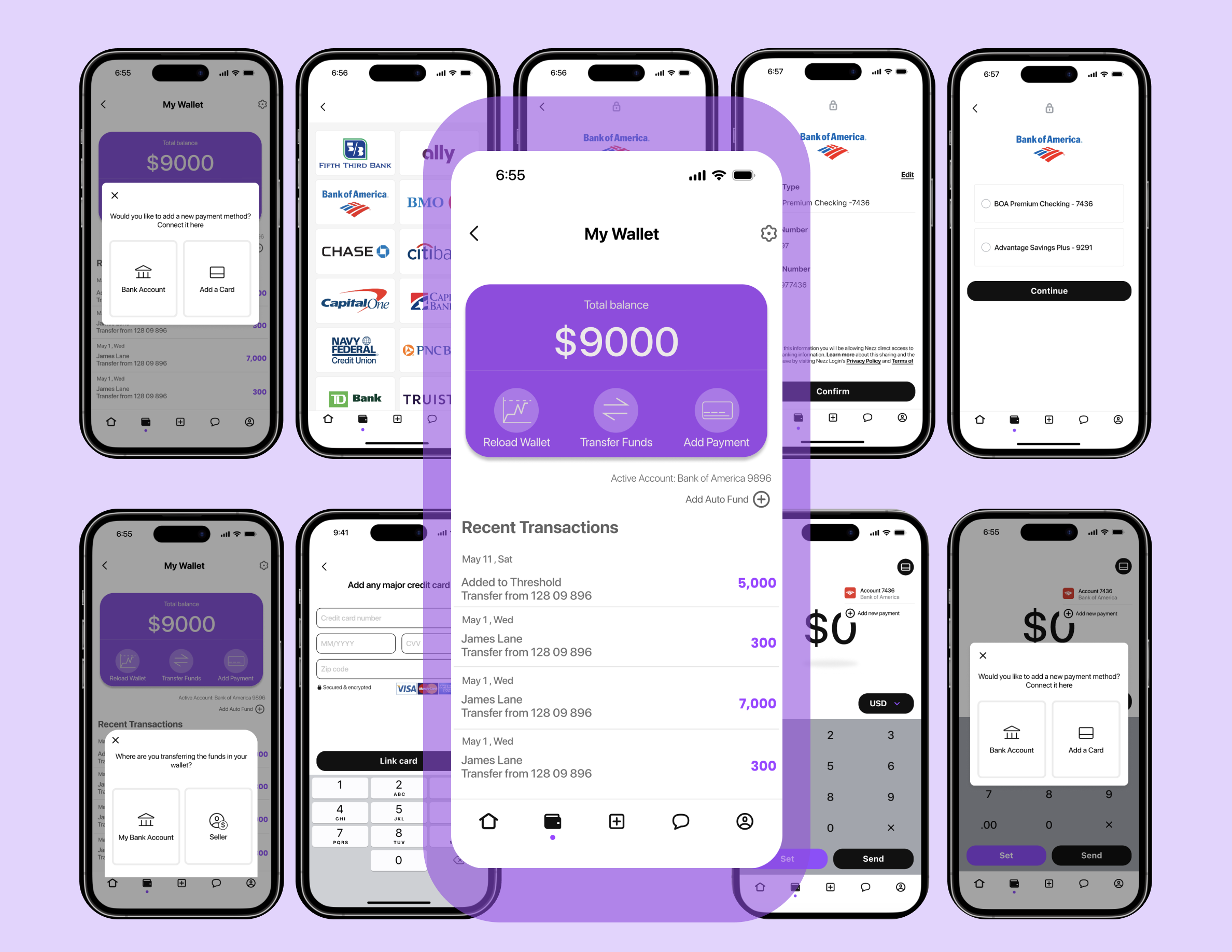
“How might we create a wallet within the app, where a user can seamlessly manage transactions with peers, and their bank”
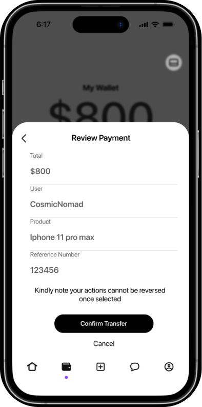
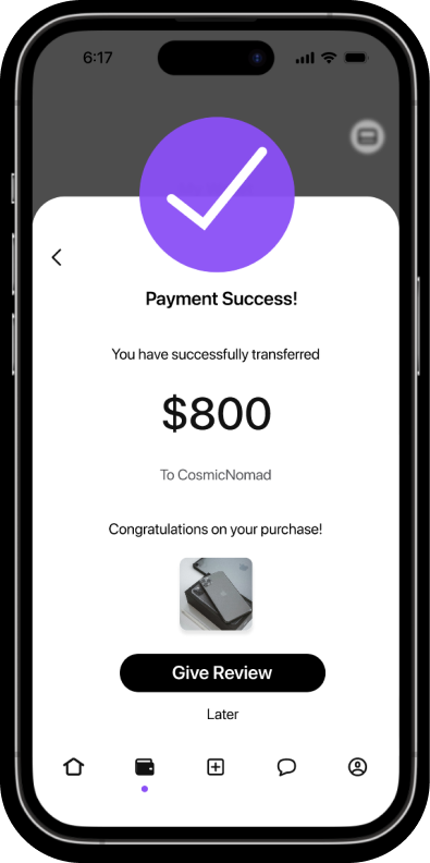
Considering the needs of our users, I designed a wallet screen where users can complete all required actions. The functions of the wallet include; reloading the wallet, transferring funds to a recipient or transferring funds from your wallet back into your bank account or card. Adding the required recipient to send money to and lastly adding a new payment or setting up an auto fund. Which means depending on the threshold amount you set for your wallet, it will automatically reload for you to ensure you always have enough money to chat and inquire about items. Recent Transactions was also an important feature to include on the main page, allowing the user to see their activities easily without having to look for it.
Keeping the company's style guide in mind, it was important for me to use purple as the colour of the wallet and incorporate it throughout the flow. It makes the pages pop with the help of the gray and black writing. I designed unique functional buttons that are easy to understand and are pleasing to the eyes as well.
Chat Flow |
Step 2
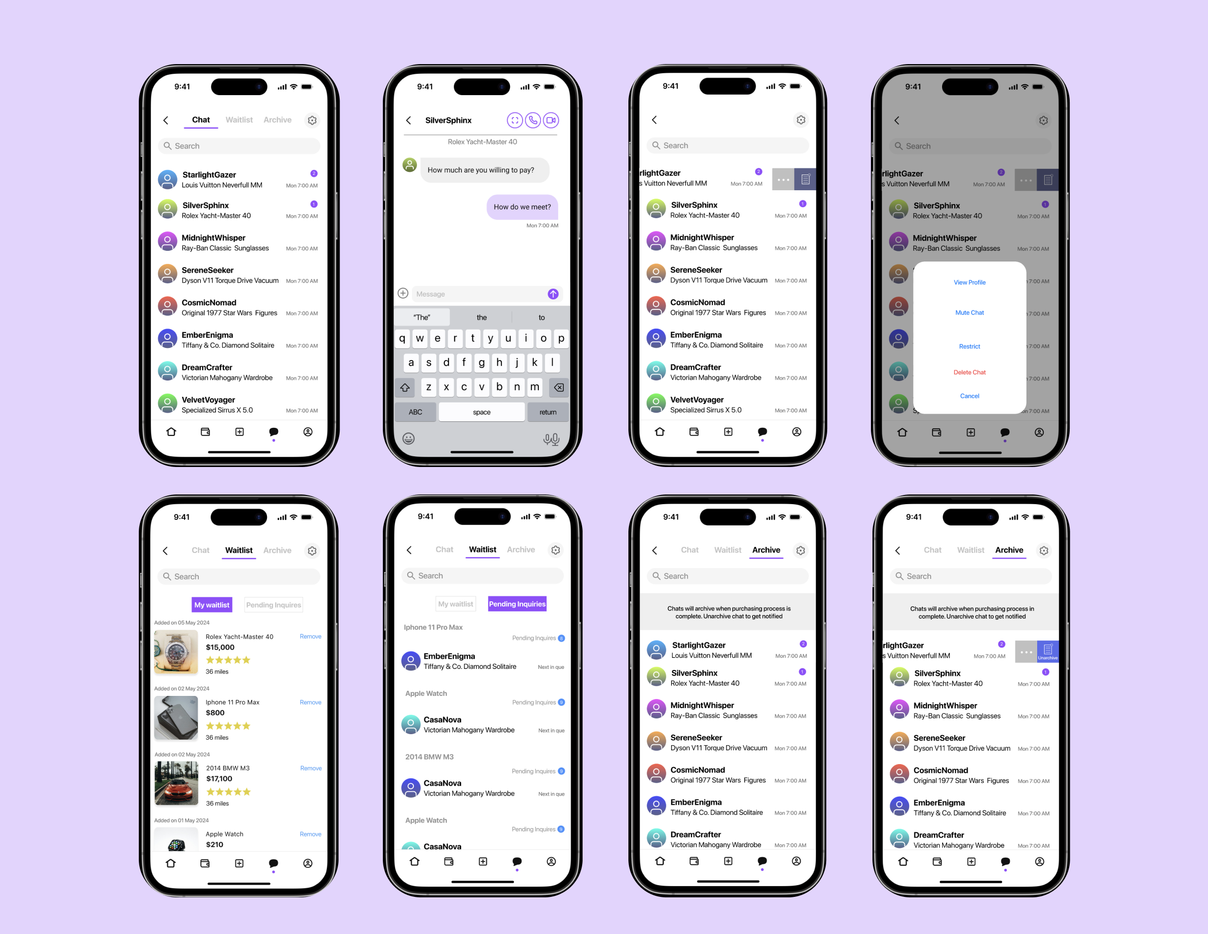
“How might we create a chat flow within the app, where a user can seamlessly manage between their chat, waitlist, and archive screens”
For the best user experience I designed a chat screen with a toggle where a user can switch between three different screens very easily. The active screen is in dark black and underlined with purple, while the other toggle options are grayed out.
Pricing Page |
Step 3
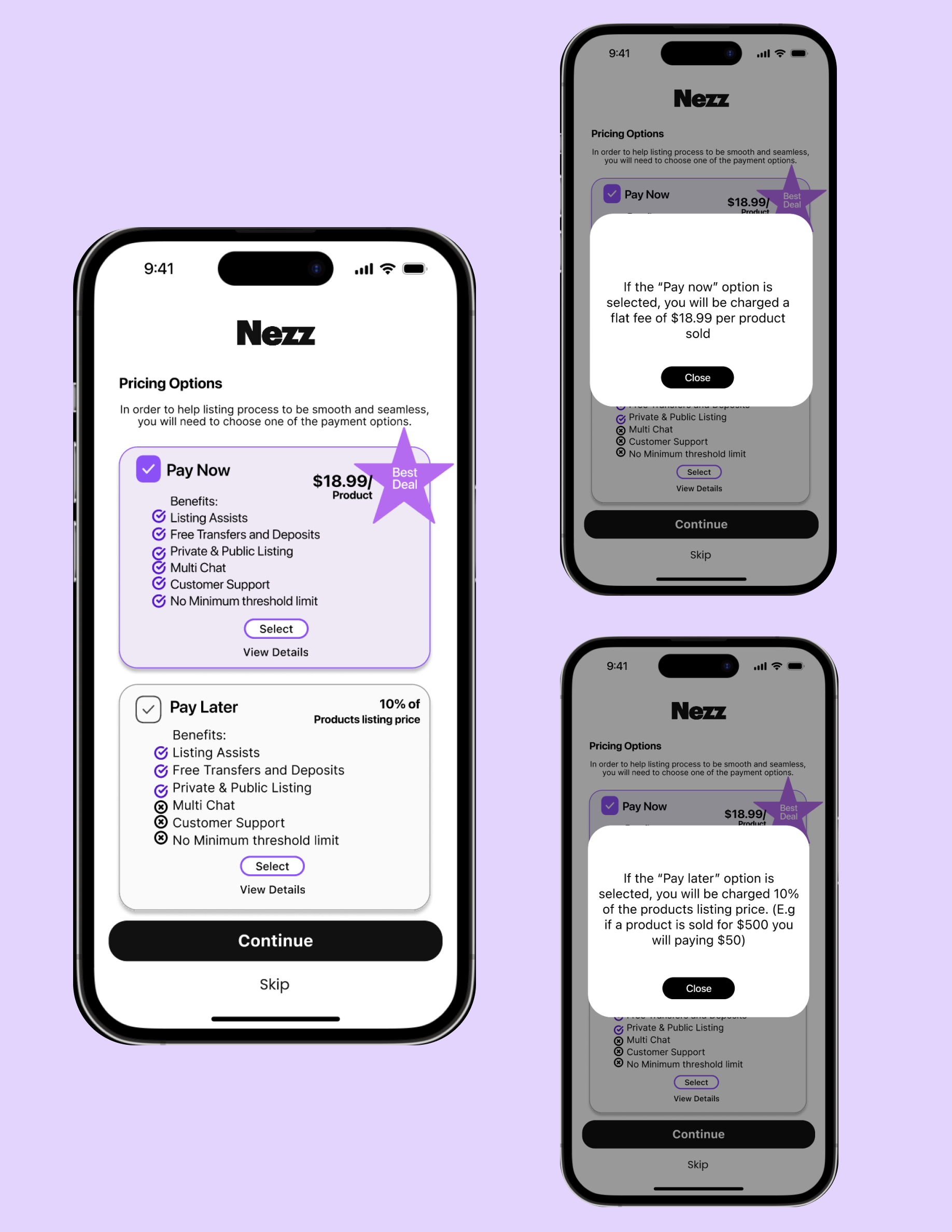
“How might we create a pricing page that encourages users to pay now rather than pay later as it is cheaper for the user and beneficial for the company”
Keeping the company's goals in mind, it was crucial to design a pricing page that encouraged the user to select the ‘pay now’ option. For this screen the UI played a special role along with the writing. For the two options I designed the first one to be more appealing with the colours, listing the benefits with checkmarks and a star that says “best deal”. Users also have the option of clicking the view details button that better describes what pay now and pay later really mean.
Prototyping for the Website |
Step 4
Lastly, along with my teammates we created functional prototypes for the website. I specifically worked on the buying process for various scenarios like a new user, an existing user logged in with money in their wallet, an existing user logged in with no money in their wallet, and the same for existing users that are not logged into their account.
Nezz |
The Conclusion
Lastly, along with my teammates we created functional prototypes for the website. I specifically worked on the buying process for various scenarios like a new user, an existing user logged in with money in their wallet, an existing user logged in with no money in their wallet, and the same for existing users that are not logged into their account.